fairplay
Branding | packaging design | PHOTOGRAPHY | INFLUENCER BOX
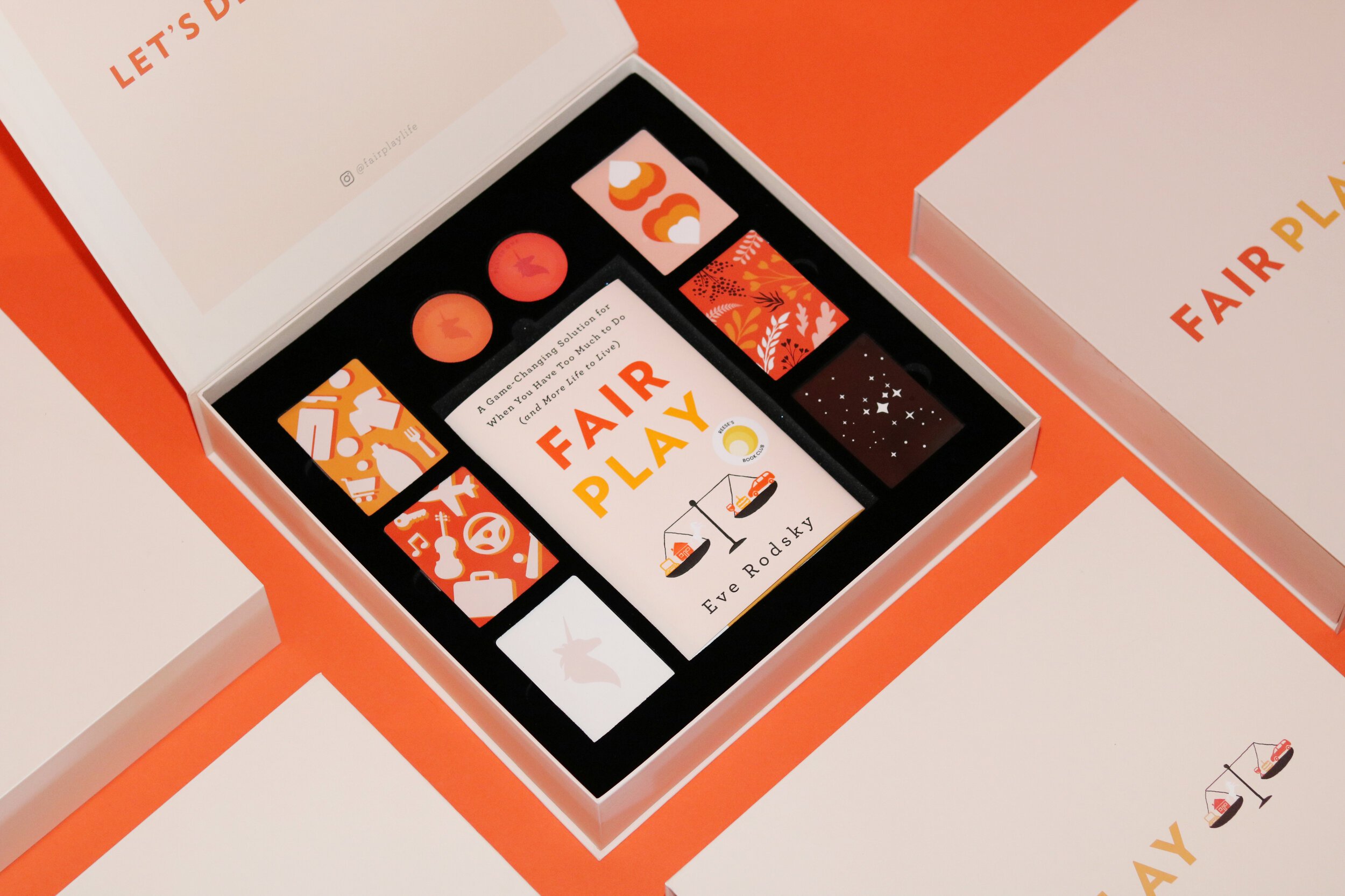
a bright approach
for fair play


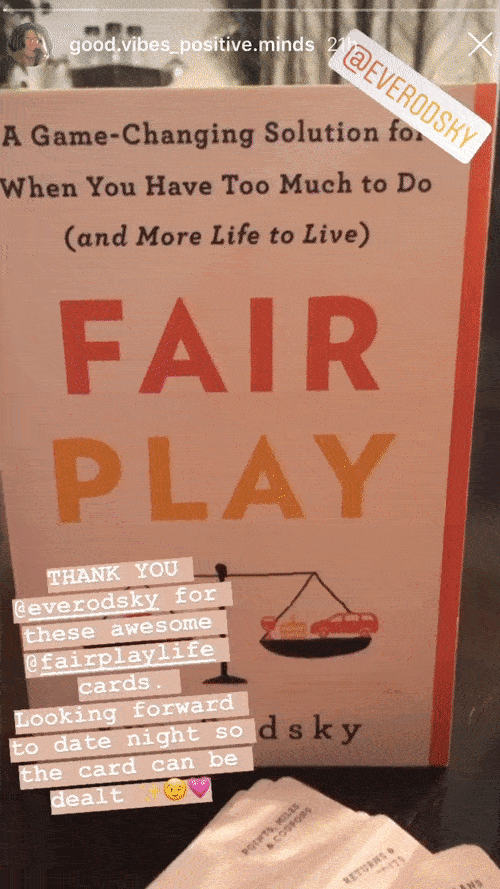
Fair Play was created by Eve Rodsky as a system to help couples equally divide domestic work. The logo incorporates interconnected balancing scales, symbolizing the seamless integration of tasks. The color palette, consisting of bright oranges and reds, feels powerful but approachable for all.